Spotted: Southbank Centre rebrand makes sense of complexity
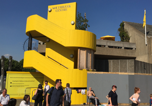
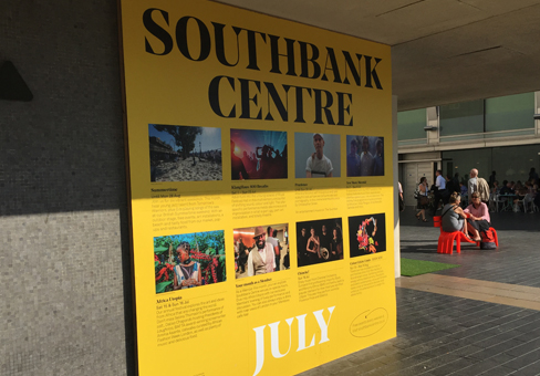
 The UK’s largest arts centre, the Southbank Centre on the Thames in London, has just rebranded solving a practical conundrum. The new identity, created by Clerkenwell-based agency North, is being rolled out across the Southbank Centre’s venues and events over the next six months. You may have seen something of the new design style and use of the colour yellow to assert the brand’s identity on your travels across the capital.
The refresh coincides with two events, one upbeat, one not. They are the completion of a two-year programme of renovations to its main buildings and the announcement in June 2017 of a reduction in Arts Council funding for the centre. Here’s hoping the fresh branding heralds a dynamic new phase for the Southbank Centre and enables it to achieve more, for less.

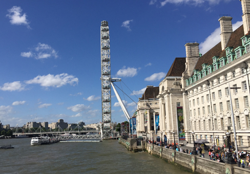
Southbank Centre covers a 17-acre site, unsurprisingly located on the south bank of the Thames in central London. Venues include the Royal Festival Hall, Hayward Gallery, Purcell Room and Queen Elizabeth Hall. Southbank Centre presents shows that span the arts from theatre and dance, to art and literature, as well as classical and contemporary music. This arts centre hosts more than 5,000 events which welcome over 6 million people each year.
The irony – North creates Southbank identity
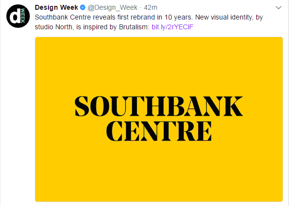
 The move by the design agency North, is the first rebrand for the Southbank Centre in 10 years and replaces the identity created by Wolff Olins in 2007. The overall identity had become complex to implement across the brand’s estate, diluting the brand over time. Part of this previous identity included a chevron/mesh graphic which was difficult to incorporate.
But aside from these difficulties with the application of the branding, the Southbank Centre identity is inherently complex since it’s both a venue and an instigator of arts events, and more importantly each and every event it hosts, has its own strong identity and needs maximum creative scope.
On 27 June 2017, the Arts Council announced its funding plans for 2018 to 2022. Extra arts funding has been allocated to organisations outside London amounting to £170 million for the four-year period. Southbank Centre is amongst the losers in London and will receive £800,000 less Arts Council funding each year, which is a 4% budget cut.
Brand hierarchy resolved
With the new identity, the Southbank Centre brand name becomes the ‘masthead’ for the brand akin to a magazine title, according to North. This is intended to enable a simpler more coherent approach, with each event freer to portray its own identity, with Southbank Centre as the masterbrand.
Bolder, simplified identity
The new identity comprises the typographic brand logo and a design framework which can be applied across posters, tickets, building signage, websites, social media and the full range of marketing materials. The logo uses a custom-designed version of the modern serif-font, Noe Display from Schick Toikka. Over the last 15 years or so many company logos have shifted from serif to sans serif fonts, including Google in 2016. By bucking the trend, it helps the Southbank Centre name to stand out as a brand, instead of being seen simply as a place name. According to North, this typographic style is inspired by the brutalist architecture of the Southbank Centre itself.
Standout style emphasised with colour
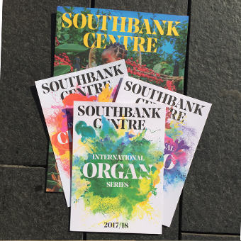
 The colour yellow had already been used on aspects of the buildings. This colour has been adopted and amplified within the new identity, with Southbank Centre claiming yellow as its own ‘property’. In colour psychology, yellow is associated with joy, happiness, intellect, and energy. Pure yellow is an attention getter and yellow is seen to arouse cheerfulness and stimulate mental activity. The colour yellow, alongside black and white, will be used to demarcate the buildings and is give the brand a distinct identity within the arts sector.
New branding – photographic images
See Jenny Brewer’s design review, ‘Southbank Centre visual identity redesigned by North, to be a “confident masthead” for the institution’ from ItsNiceThat.
Old branding - what came before?
For excellent before and after images see ‘A serif rises in the South’ from the chronicler and debater of brand identities, Brand New.
Ten years ago, the Wolff Olins design style set a new benchmark for flexible branding and was honoured with a Special Jury prize in the International Museum Communication Awards for the scale and ambition of its playful design solution. See the design agency’s Southbank Centre Case Study.
Fierce and elegant typography
Independent type foundry, Schick Toikka, explain the rationale for their original Noe Display font. Read the description of the font’s ‘personality’ and assess the brand fit for yourself. See: About Noe Display
Tweet your reaction to this arts identity
#southbankcentre #NewBrandID @CIMinfo_London
What marketing initiatives have you spotted in London?
Tweet @CIMinfo_London #BrilliantMarketing

